PROJECT SCOPE
• Online Fashion Shopping Platform
• Date: October 2025 - Present
• Duration: In Progress
• My Role: UI Designer & Researcher
• Methodology: Storyboarding, Wireframes
• Tools: Figma, Google Docs
RESEARCH OBJECTIVE
• Our product is an online outfit shopping website that connects shoppers with professional fashion advisors and buyers to create a more personalized and guided shopping experience.
• It allows users to interact through distinct roles: shoppers looking for outfit recommendations, advisors creating outfits, and buyers fulfilling the final purchases, within a single cohesive interface.
• The purpose of this system is to simplify the process of finding and purchasing outfits by using expert styling advice and combining it with convenient online shopping.
• This system aims to provide users with curated outfits suggested that reflect their personal tastes and needs, while minimizing the time and effort required to search for items individually, on their own.
WHAT WAS THE PROBLEM?
• Consumers often struggle to make confident fashion purchases due to a lack of personalized style advice, overwhelming product choices, and limited access to expert insights, leading to dissatisfaction, returns, and wasted time.
HOW MIGHT WE. . .
• Develop a platform where shoppers can store their size, style, color, and fabric preferences, view and approve outfit suggestions from fashion advisors, and place orders for selected outfits.
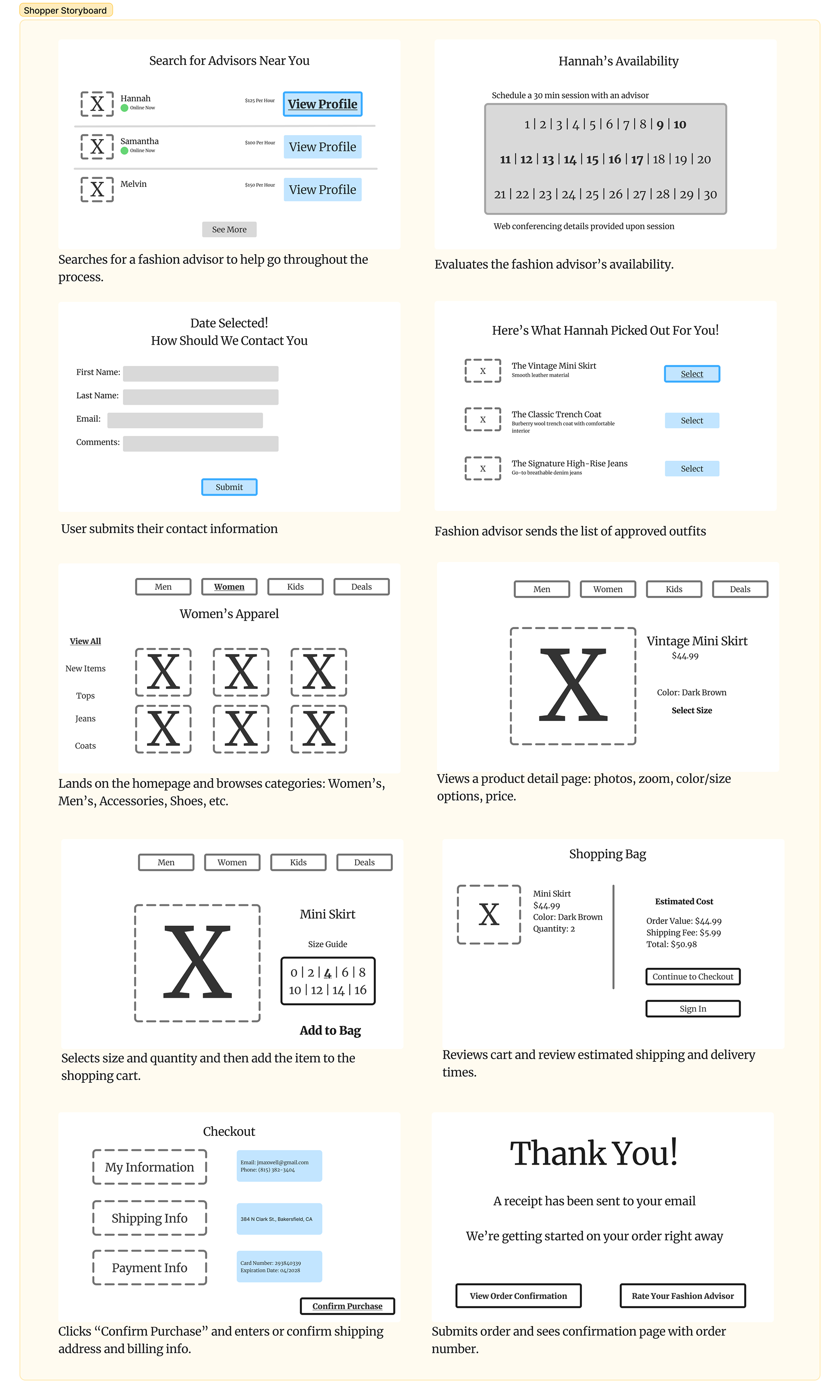
FASHION SHOPPER STORYBOARD FLOW
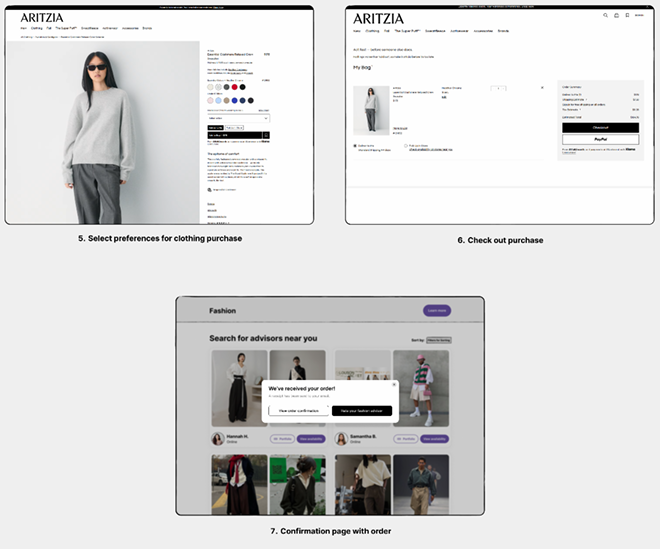
1. Lands on the homepage and browses categories: Women’s, Men’s, Accessories, Shoes, etc.
2. Views a product detail page: photos, zoom, color/size options, price.
3. Selects size and quantity and then add the item to the shopping cart.
4. Reviews cart and review estimated shipping and delivery times.
4. Clicks “Checkout” or “Buy Now” and enters or confirm shipping address and billing info.
6. Submits order and sees confirmation page with order number.
FASHION ADVISOR STORYBOARD FLOW
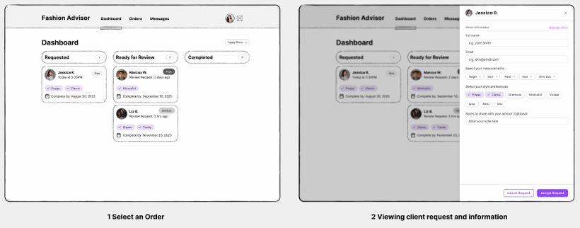
1. Fashion advisor logs on and views the dashboard, which shows their current assignments and progress for each.
2. After starting an assignment, the advisor views the shopper's profile, which lists their preferences and sizes.
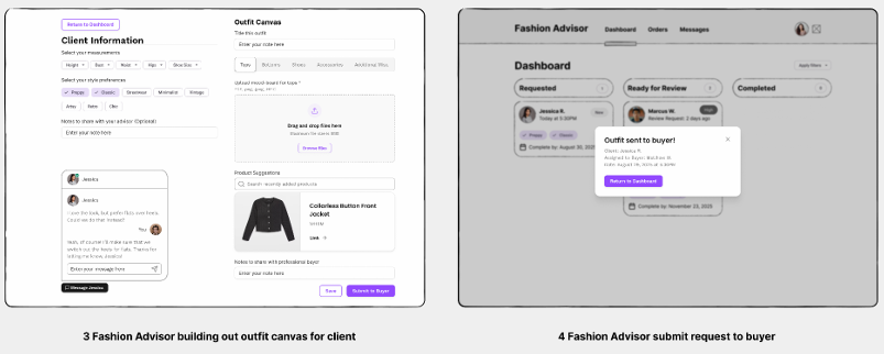
3. While creating an outfit, they're able to preview it in real time.
4. Once the outfit is created, the advisor can name the outfit and add other important details, and when finished, they can send it to the shopper.
5. The advisor is able to communicate with the shopper in the chat, where they can provide feedback, make adjustments, and then send the final outfit to the buyer.
6. The outfit is sent to the buyer, and the advisor receives a confirmation; the status of this assignment is changed on the dashboard.
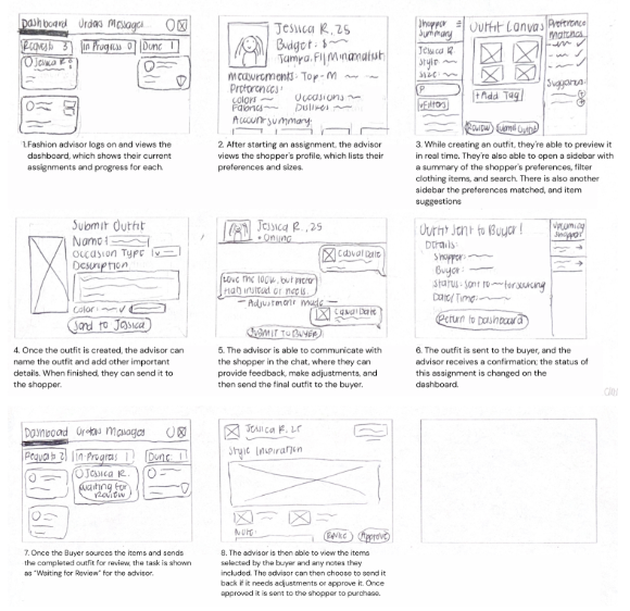
FASHION BUYER STORYBOARD FLOW
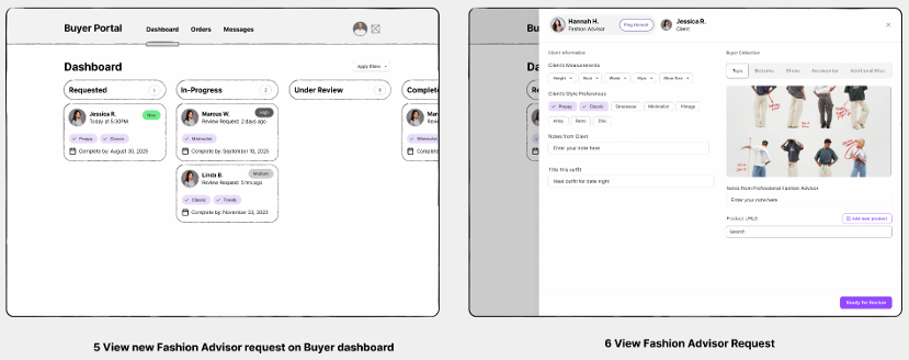
1. View open requests from advisors.
2. Select an order from the request card to view full details.
3. Source items for the order.
4. Request fashion advisor review after all items are completed.
5. Fashion advisor reviews all sourced items against moodboard and style tags.
6. If approved, the buyer then marks it as complete.
2. Select an order from the request card to view full details.
3. Source items for the order.
4. Request fashion advisor review after all items are completed.
5. Fashion advisor reviews all sourced items against moodboard and style tags.
6. If approved, the buyer then marks it as complete.

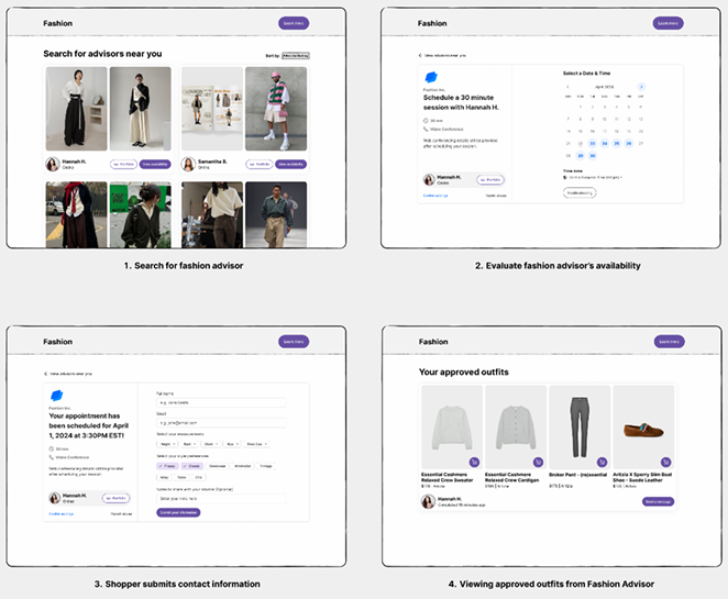
MID-FIDELITY PROTOTYPE (USER JOURNEY 1)
• Shopper finds fashion advisors and purchases clothes from fashion advisor.
MID-FIDELITY PROTOTYPE (USER JOURNEY 2)
• Fashion advisor receives request from shopper and submits/approves professional buyer list.

USER FEEDBACK
• Found the process of browsing and ordering outfits simple and straightforward Payment steps were clear and intuitive.
• Felt like an inclusion of a user selecting their preferences in the shopper flow would have been helpful to see.
• It could be helpful to provide shoppers with multiple outfits/different item options.
• The weakest point is potentially a back-and-forth between the advisor and buyer, which could slow things down, especially if mistakes occur.
• An improvement idea could be to include an outfit preview on a model, rather than a collage/mood board.
KEY TAKEAWAYS
• The primary design decision for the shopper was focused on helping users identify advisors in their area that can assist them in their shopping process.
• The fashion advisor flow was designed to show the advisor's role in creating personalized outfits that reflect the shopper's preferences for style, color, occasion, and more.
• Consistent layouts and navigations were used across all roles to create a streamlined experience.
• When implementing the kanban-style dashboard for both the Fashion Advisor and Professional Buyer, it helped visualize and manage their ongoing requests.
• The kanban format also helped align both roles under a shared mental model of progress, improving efficiency in the process.