PROJECT SCOPE
• Mot à Mot
• Date: October 2025 - Present
• Duration: Ongoing
• My Role: UX Researcher, UI Designer
• Methodology: Information Architecture, User Flows, Surveys, Usability Testing,
• Tools: Figma, Zoom
RESEARCH OBJECTIVE
• Mot à Mot (French for "word for word") is an early-stage product that bridges the gap between the user and their language-learning goals.
• This means understanding interests and pain points that potential users might have while developing their skills in a different language.
• Mot à Mot seeks to offer features that are often not included in other notetaking platforms, such as grammar and vocabulary quizzes, flashcards, group forming, and community forums that gauge language-exchange.
WHAT WAS THE PROBLEM?
• There are very few digital note-taking applications that focus on language-learning, creating a significant gap for users.
HOW MIGHT WE. . .
• Develop an engaging and interactive application that allows users to explore, organize, and track their language-learning interests?
PROJECT CONTRAINTS
• This project was conducted under tight time constraints, which required prioritizing speed and efficiency throughout the design and research phases.
• Nonetheless, I prioritized a user-centered approach and focused on thoughtful, effective solutions to the user problem.
• Due to the fact that I couldn't run several iterations, I focused on highlighting functionality and core features.
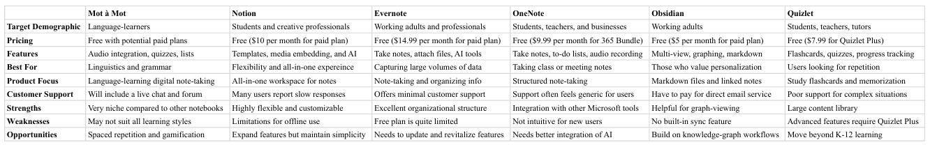
COMPETITOR ANALYSIS
• I analyzed several platforms such as Notion, Evernote, and Quizlet, mainly focusing on the advantages they provide for language-learners.
• While these applications can certainly be leveraged for language-learning purposes, they primarily focus on general notetaking, creating a disparity for some learners.
• A key insight from my analysis was that many of these platforms had excellent organization and features, but lacked the niche appeal that many language-learners might need.
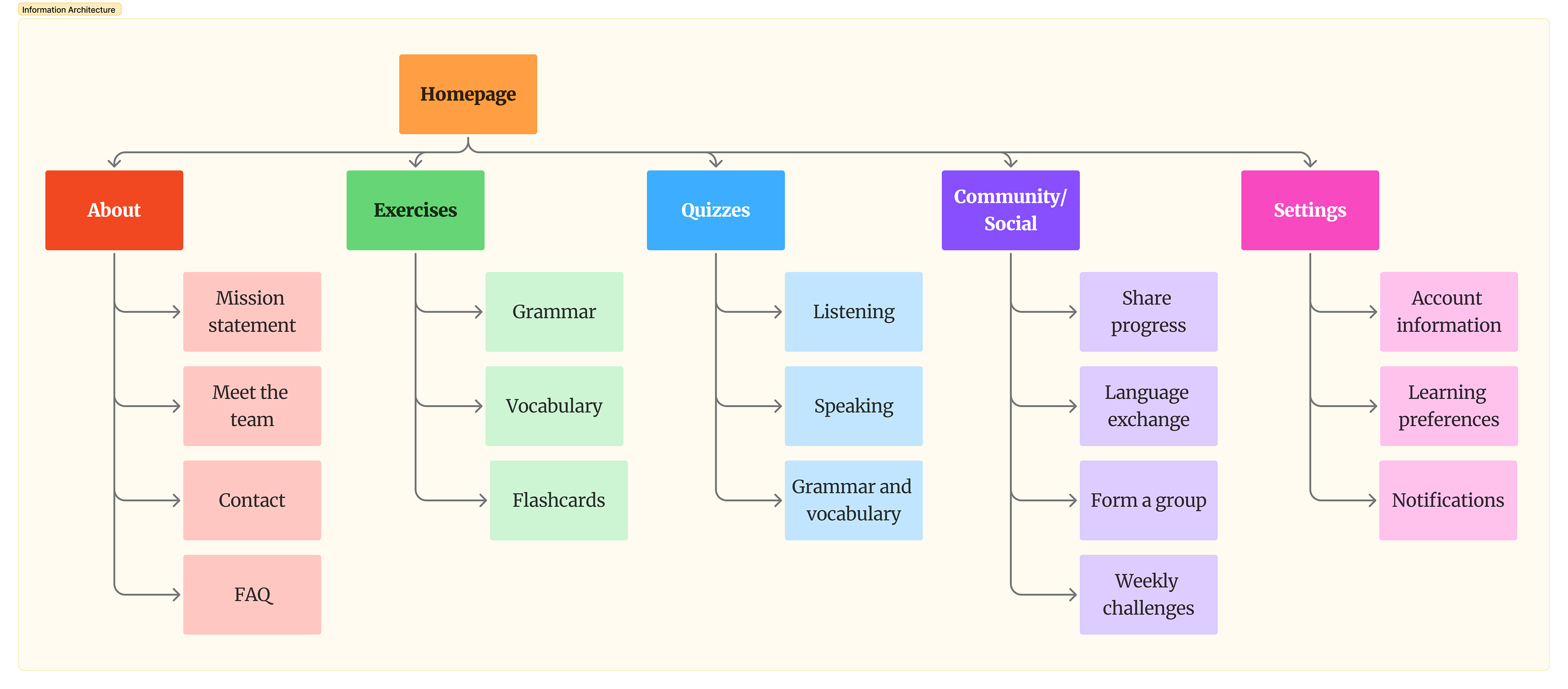
INFORMATION ARCHITECTURE
• Prior to developing the prototype, it was integral that I first layout the features that would help users navigate the platform and ensure easy navigation.
• By generating a functional model of the content structure, I have greater confidence that the prototypes meet the needs of users who seek language-learning features.
• Given that are very few notetaking applications that focus specifically on languages, the aims of the IA were simplicity, functionality, and consistency.
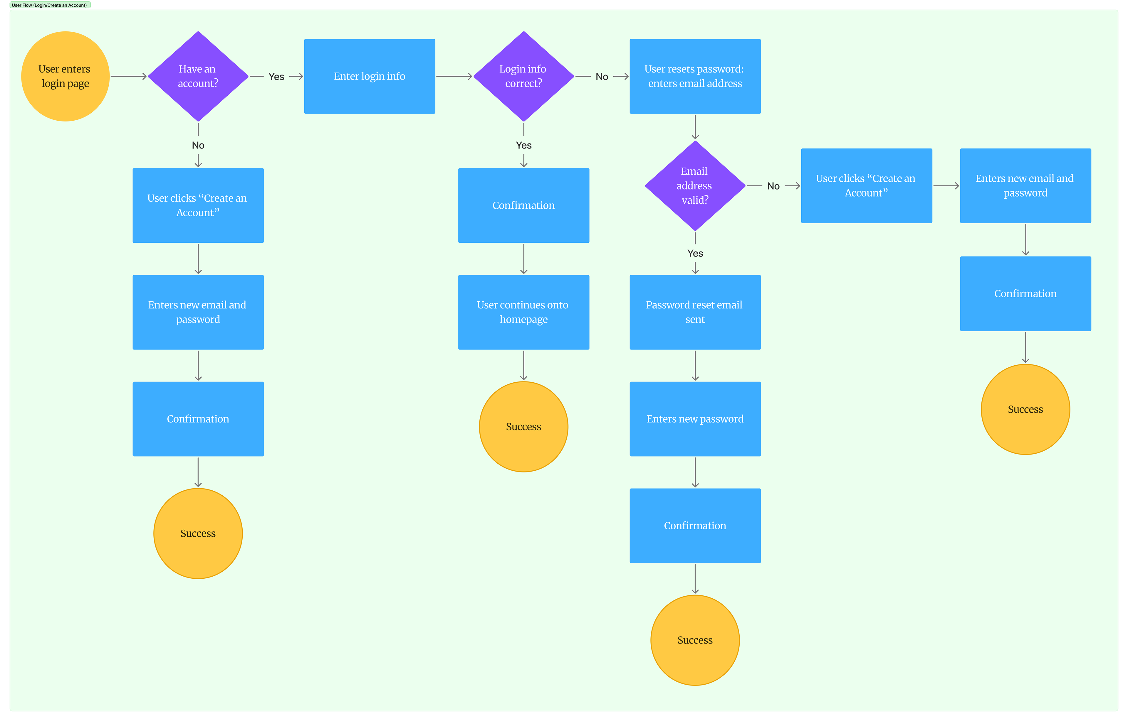
USER FLOW
• The user flow that I created focused on pinpointing how the user would go about creating a Mot à Mot account or logging into an existing one.
• The goal was to streamline the process and focus on minimizing steps on the user's end while reducing cognitive load.
• Along with the IA, the user flow that I generated served as the foundational step in creating prototypes that were functional and responsive.
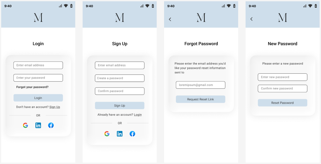
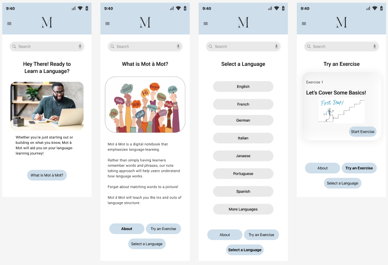
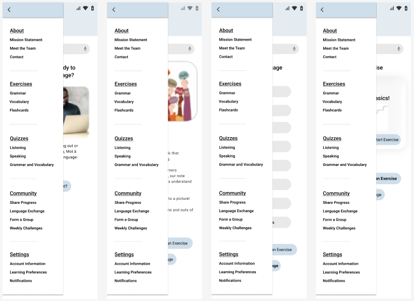
HIGH-FIDELITY PROTOTYPES
• In order to make sure the layout was intuitive, I developed prototypes that were consistent, navigable, and provided clear visual cues.
• This includes features such as clear typography, distinctive hierarchy of headings and content, consistent spacing, and intuitive iconography to guide users through each interaction.
• Similar to that, the prototypes were designed with responsive layouts so that users could navigate seamlessly across different devices and screen sizes.
ACCESSIBILITY STANDARDS
• For keyboard navigation, I ensured that users would be able to interact with the features with only the keyboard if necessary.
• This meant every feature was accessible using only the "Tab" and "Esc" buttons, for those who don't have mouse controls.
• Another accessibility standard was readability, as I made sure to develop the prototypes using a simplistic and consistent font throughout the design.
• In addition, I designed the prototypes with visual accessibility and clarity in mind, making sure that that color contrast, spacing, and layout supported users with visual impairments or cognitive difficulties.
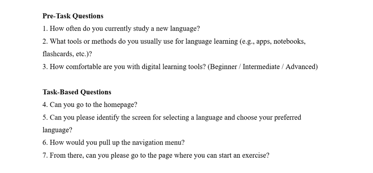
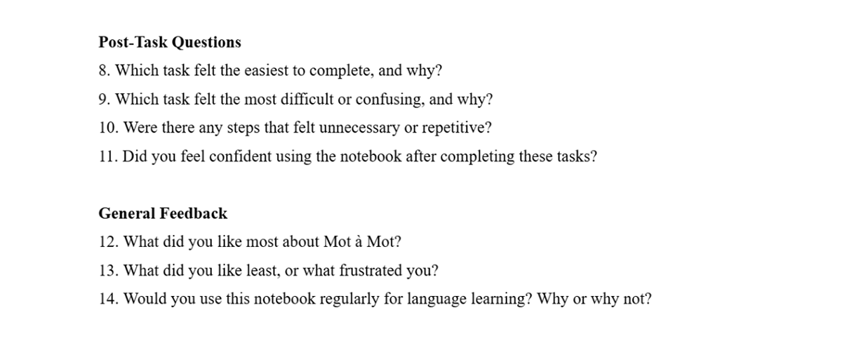
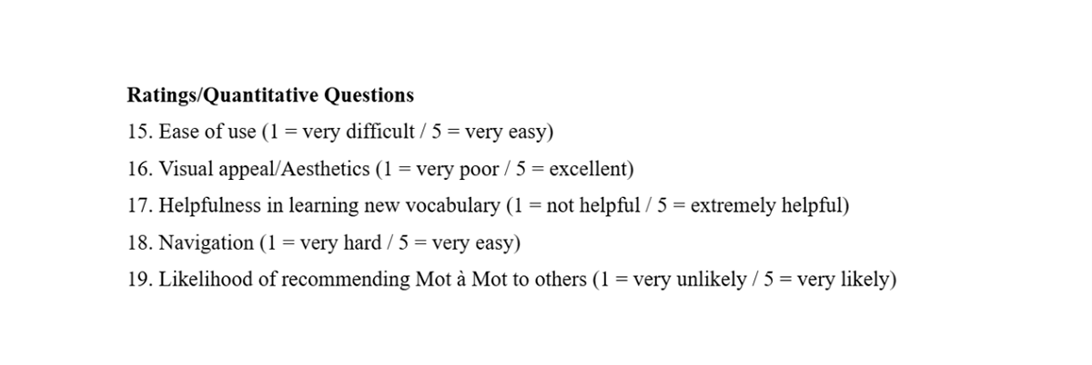
USABILITY TESTING
• I conducted three usability tests in total with potential users.
• During my analysis, I wanted to assess how easily users could perform certain tasks, such as finding the homepage, selecting a language, and starting an exercise.
• Through this, I was able to shed light on the common user pain points, as well as insights can that improve the overall usability.
USER INSIGHTS
• The users whom I interviewed stated how the homepage was easy to identify and how it was great that there were links to the other screens at the bottom of the page.
• Common pain points were that some users had trouble differentiating between the homepage and the about page and felt that they should have been collapsed into one screen in a concise fashion.
• Several participants suggested adding brief contextual cues or tooltips to help distinguish content sections, especially for first-time visitors.
• Based on this feedback, I recommended consolidating redundant pages, improving menu labeling, and adding subtle design cues (e.g., highlighted tabs) to enhance orientation and reduce confusion.
STAKEHOLDER REVIEWS
• I consulted with two stakeholders, including a product owner/designer, as well as a marketing specialist.
• The positive facets that they noted were that Mot à Mot had a clean and intuitive layout, clear navigation, and consistent visual design, which made it easy to understand and interact with.
• They also appreciated that key features like language selection and exercises were easy to locate, and that the prototypes reflected a thoughtful approach to accessibility and user experience.
• Moreover, some stakeholders felt that it could've been improved by refining the menu labels and including more context for the exercise page.
KEY TAKEAWAYS
• Through early usability testing, I discovered that users sometimes struggled to differentiate between pages, which guided me to rethink navigation and simplify the layout.
• Mapping out clear information architecture and user flows allowed me to design an experience that felt intuitive, helping users focus on their language-learning goals without friction.
• By creating high-fidelity prototypes with attention to accessibility, visual hierarchy, and responsive design, I ensured that every interaction was clear, engaging, and inclusive.
• Collaborating with stakeholders confirmed that the design choices resonated with users, which validated Mot à Mot's core features and highlighting opportunities for refinement.